Finding the WOW: Graphic Design vs. Web Design
When clients think about digital marketing, they often think about what they want a logo or website to say or do, but from a designer’s perspective, all that begins with the look, and underneath that look resides a complex marriage between user experience, SEO, and visuals. To take advantage of those complex elements, a designer invites them in, and that applies to both graphic design and web design.
Where We Start
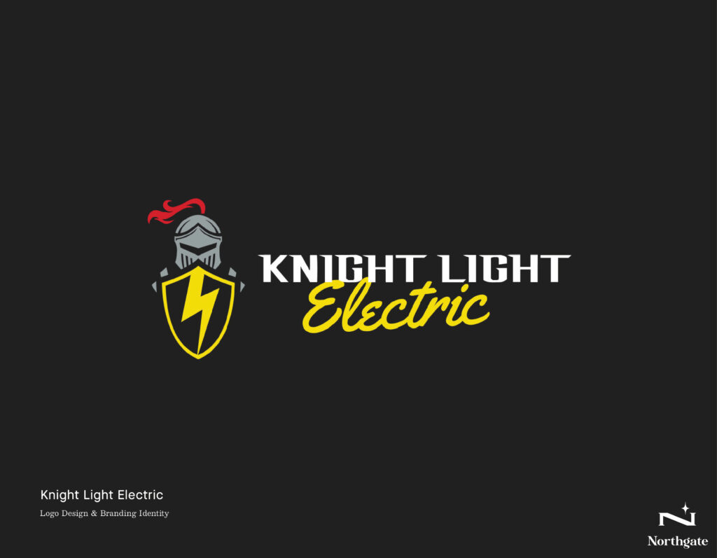
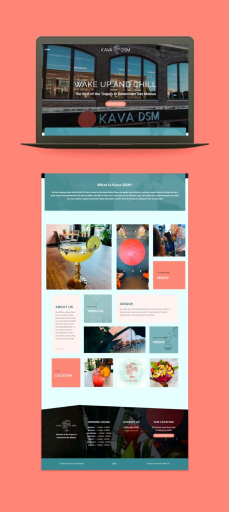
Because a designer begins with the look, we need first to discover what kind of look we’re trying to achieve. Done right, it’s a process that starts with a few questions. First, we ask the client about content and images they like and any other information about look or what they want to see and from that, we develop a UX. Designs also have a feel, like elegant, playful, traditional, bold, serious, modern, minimalist. Sometimes, a client can’t easily articulate what they want but they will always be able to describe what they like – slick and direct like Apple or ornate and rich like Mazda or colorful and catchy like Firefox. They will also know who they are and, more importantly, who they want to be. Northgate had a client who’s an electrician, but saw himself as a superhero, so we made him one, Knight Light Electricians. We had a Des Moines restaurant, Kava DSM, that wanted to project a tropical paradise, so we did that, too.
To these, we apply extensive market research and brand psychology, expertise upon which clients rely.
After that, they need branding and branding starts with graphics.
Graphic Design
A graphic designer thinks in images. It’s all about creating and manipulating images with text and includes the development of logos, flyers, banners, printed products, t-shirts,and hats, all kinds of printed products and merch. If a client wants a logo, it’s graphic design work.The agency they both work for considers who will engage with these elements and how they will interact and make decisions as a result.
As different as the end products are, however, the process is the same. The designer’s ideas start with the client’s vision.
The Bridge: Graphic Design vs. Web Design
Graphic design becomes part of web design when it’s used digitally for a website. Graphic design is about the look. Web design adds movement and life. A web designer needs to know how to do graphic design to be as good as they can be. They are two different worlds, but they complement one another.
A graphic design is usually a one element thing. It’s a logo or a sign. A website is one project but it often has multiple components – distinct sections like About, Portfolios, Ecommerce, or Contact. Even a one page design has more than one element. It’s possible to be a web designer and not know how to manipulate graphics, but that person will need someone else, a graphic designer, to do that part of the work. A web designer who knows graphic design is a real asset for any good marketer.
Websites Before the Design Begins
A lot of people don’t care much about websites until they see other companies doing better than they are. For instance, my kids are in gymnastics and some of the participants are in high school, competing for college scholarships against athletes of similar ability and accomplishment whose sponsoring organization has a better website. Is that the reason they are getting more scholarships? I don’t know, but I do know that a website brings credibility, and I intend to give my kids a website better than the one for USA gymnastics.
A website has to be creative and unique. It has to look professional. First impressions are really important. It has to be eye-catching. All the websites I create are focused on two things: the WOW first impression and making them so professional looking that prospective clients can’t tell whether they’re looking at a small or huge business. This holds true whether I’m creating a personal, business, or organization website.
It’s important to hear the client’s heart, perspective and vision. I have a style, a way I like things, but if the client wants in another way, we adapt to it. We have to be open minded enough to adapt, and to still bring our own skills and gifts to create that art, that project.
Designers are artists, and it takes flexibility because sometimes clients ask for something the designer thinks is too restrictive. In other words, because the designer lives in a world of imagination, they can often see something more than what a client asks for. I want to help them think bigger. You really have to be open to see the client’s perspective and what they want to show to the world, but you can help and encourage, direct and guide them towards what would be better for them. It has to be a collaboration.
It’s our job to help them see that there aren’t any small businesses. There are just businesses waiting to be big. Anybody can become somebody, but we all need a little bit of help and that help comes from graphic design and web design artists.
Website Strategy
I start web designs with the bones, which means knowing all of the client’s vision, everything they want, the website’s basic construction, whether it’s multiple pages or one scrolling page or whether it includes an online store. The client needs to give us everything they have: logo, images, content. Written content, done before the web design, helps provide structure for the site.
When you open a website, the first impression is very important. It has to be WOW, it has to be catchy. It has to grab your attention so you will keep scrolling or continue to the next page. I do this most often with faces. Faces are really important. When I see an image of someone, I can relate to them because we’re all people. People are relational. We don’t like to be alone. When I see a face that’s hurting, I hurt. When I see someone smile, I smile too. When we see faces, we instantly connect with them and make them part of us. If that face is on a website, I want to learn more.
When dealing with titles and text and description, less is better, but the information used has to be correct, exact, and optimized for search engines (SEO). When a website has a lot of content, people don’t go through it. Fewer elements, ones that are clean, work better. When a client requests more content, it’s our job to put it together so that it doesn’t look like they’re reading a book.
This is where the designer uses negative spaces. For instance, in a photograph negative space is the sky or blank wall behind the subjects. Leave some room so the content doesn’t feel too cluttered. Photographs may need to be manipulated. This is where the graphic design comes in. Proficiency in Adobe Suite products like Photoshop and Illustrator helps here.
The Real Deal: Web Designer Code
A website comes in sections. That way, a designer can subject each section to different effects and animations. Visually, this helps the viewer. Real web design creativity comes in when deciding how the viewer moves from one element to another.
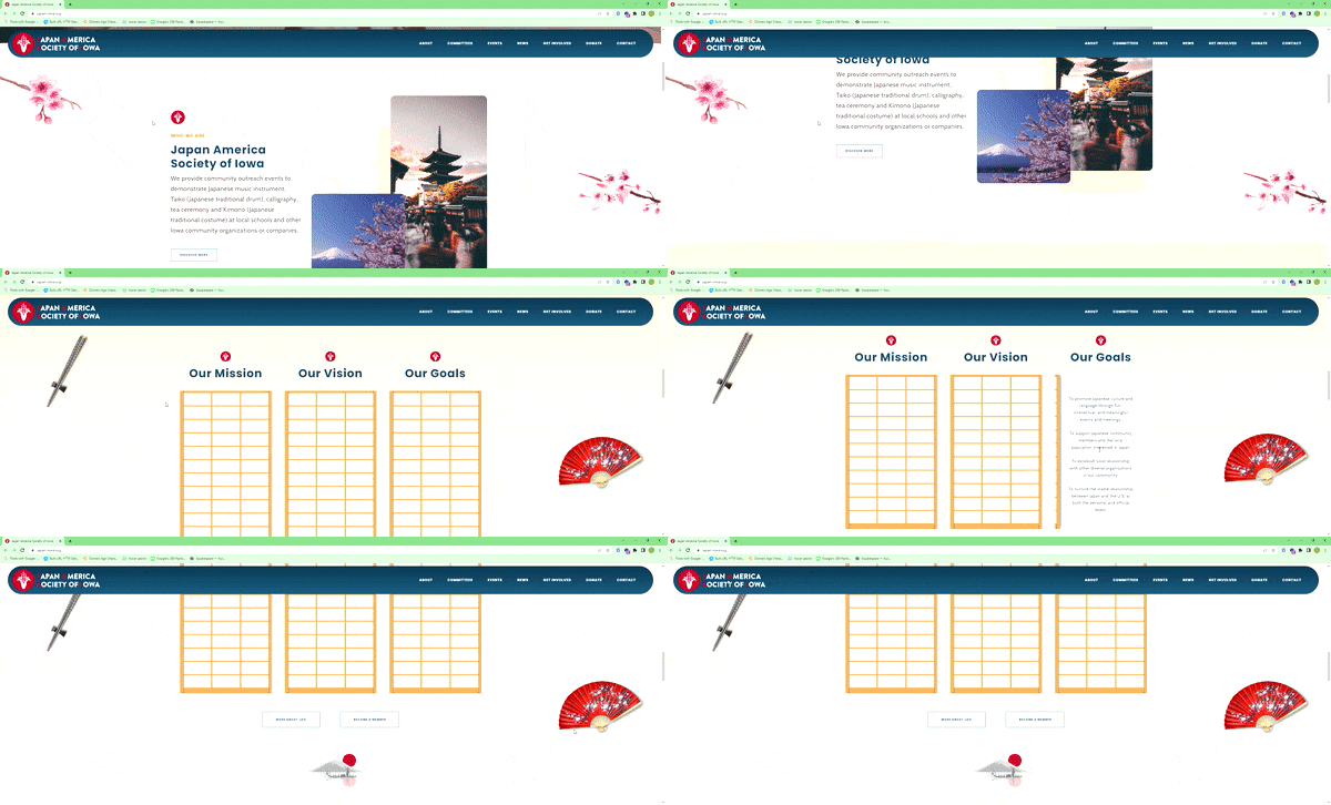
The site I designed for the Japan America Society of Iowa is a great example. The scrolling happens in more than one way in that the images move either with you or in the background. The people in the images are immersed in the culture. It opens with a video playing clips that take you into that world. That’s what you want. You want the viewer to get inside the computer and surf and get connected. At JASI, when you surf, you see a lot of elements, all related to the culture and vision. The elements pull you in.
I love the visual elements of JASI. When you scroll, the elements you see are part of Japan: a pagoda, cherry blossoms, the rising sun. Some of the images are photos, some are drawings, and some are just creative freeform elements, and all required graphic design. Without graphic design work, good web design can’t happen. Scroll down, you see chopsticks, a fan, and rice paper doors. Same thing. Then I added a new animation, making the doors slide open and closed rather than use a clickable button. Everything invites you in. Even the contours separating the sections mirror each other and the mountains they evoke.
There’s so much stuff to use, even colors. JASI starts out in pastels and by the end is vibrant with reds and blues. That’s called gradient. Even the lines between sections are wavy and broken up to give them a sense of warmth and motion. It’s important to play with sizes of the sections and elements.
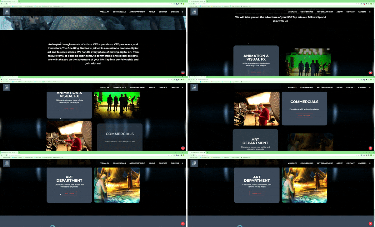
The effect of differing scrolling rates is called parallax. One Ring Studios, is a good example of parallax. The text becomes an integral moving part of the different scenes. Objects come into the central fields from the sides. Visually, that’s really stimulating.
To get these effects, I used some new coding techniques. This is where a community is important. Web designers share. Our Northgate designers collaborate and there are boards online where these ideas are available. An excellent web designer is knowledgeable, humble, and willing to ask for help. That’s how we grow. Nobody has all the knowledge or all the ideas. You constantly want to become a better creator.
The Last Word in Web Design
In the end, having a professional website is a must. It’s our clients’ frontline, telling the world that their business or organization is for real. It’s their most important tool representing their vision and what they do. As designers, whether graphic designers or web designers, it’s our privilege to help them get there.
Author, JoAnne Potter
Co-Author, Rodrigo Cisneros
